

A line graph is a simple way to show how something changes over time or across an ordered set of values. It uses points connected by straight lines to make a trend easy to see. Line graphs are widely used in math, science, business, weather reports, school projects, and data analysis. They can show increases, decreases, steady values, and changing patterns at a glance. This guide explains the line graph definition, parts of a line graph, examples, types, uses, advantages, and how to create one, using simple language suitable for students and everyday learners in 2026.
What Is a Line Graph?
A line graph is a type of chart that uses connected points to display data and show how values change. Each point represents a value, while the connecting line makes the overall pattern easier to understand.
- 📊 A line graph displays data visually.
- 📍 Data points represent individual values.
- ➡️ Lines connect the data points.
- 📈 Rising lines show an increase.
- 📉 Falling lines show a decrease.
- ➖ A flat line can show no change.
- 📅 Days, months, and years can appear on the x-axis.
- 🔢 Numbers usually appear on the y-axis.
- 📝 A clear title explains the graph.
- 🔎 Labels help readers understand the data.
- 📏 Equal intervals make graphs easier to read.
- 🎯 Line graphs make trends easy to spot.
- 📚 Students often use them in math and science.
- 💼 Businesses use them for performance data.
- ⭐ They are useful for comparing changes over time.
The main purpose of a line graph is to make change and trends visible. Instead of reading a long list of numbers, you can often understand the pattern by looking at the line.
Parts of a Line Graph
A good line graph has several important parts. Each part helps the reader understand what the data means and how to read it correctly.
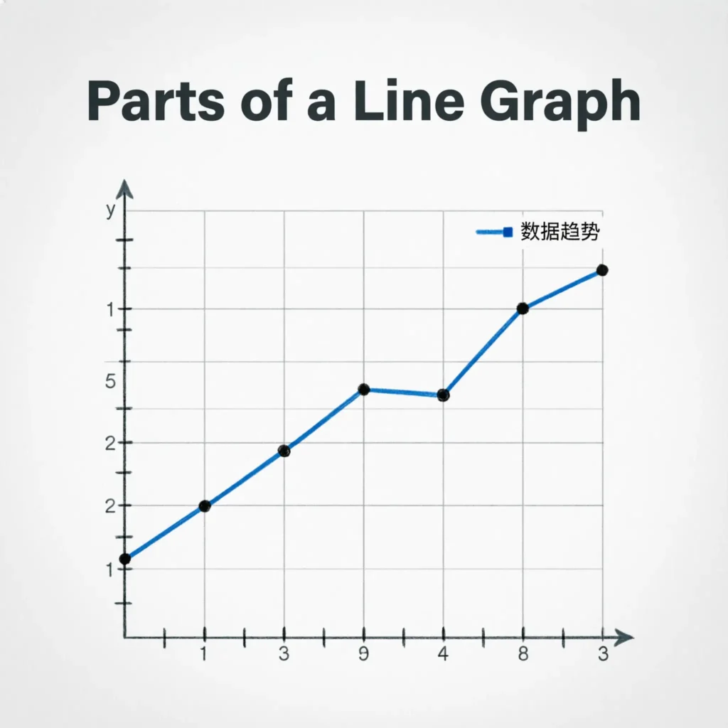
- 📝 Title tells what the graph represents.
- ↔️ X-axis usually shows the independent variable.
- ↕️ Y-axis usually shows the measured value.
- 📍 Data points show individual measurements.
- 📏 Gridlines can make values easier to read.
- 🔢 Scale shows the numerical intervals.
- 🏷️ Axis labels explain each axis.
- 🔗 Connecting lines show the trend.
- 🎨 Legend helps identify multiple data sets.
- 📊 Units explain measurements.
- 🕐 Time labels can show dates or periods.
- 🔎 Markers can highlight individual points.
- 🎯 Reference lines can show targets.
- 📈 Trend direction shows movement.
- 📉 Changes in slope can show faster or slower changes.
- ⭐ All parts work together to make the graph understandable.
Before interpreting a graph, check the title, axes, scale, and units.
X-Axis and Y-Axis in a Line Graph
The x-axis and y-axis provide the basic framework for a line graph. They tell you what is being measured and how the values are arranged.
- ↔️ The x-axis runs horizontally.
- ↕️ The y-axis runs vertically.
- 📅 The x-axis often shows time.
- 🔢 The y-axis often shows numbers.
- 🏷️ Each axis should have a label.
- 📏 The scale should be clear.
- 📍 Points are placed using both axes.
- 🧮 The x-value identifies the position horizontally.
- 🧮 The y-value identifies the height.
- 📊 Together they locate each data point.
- 🕐 Time can be shown from left to right.
- 📈 Increasing values move upward.
- 📉 Decreasing values move downward.
- 🔎 Equal intervals help accurate reading.
- ⭐ Understanding both axes is essential.
For example, a graph showing weekly temperatures might place days on the x-axis and temperature on the y-axis.
How to Make a Line Graph
Creating a line graph becomes easy when you follow a clear order. Start with the data and then build the graph around it.
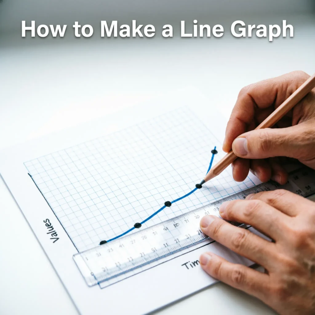
- 📝 Collect your data first.
- 📊 Organize the values in a table.
- ↔️ Choose what belongs on the x-axis.
- ↕️ Choose what belongs on the y-axis.
- 🏷️ Label both axes.
- 📏 Select a suitable scale.
- 📍 Plot each data point.
- 🔗 Connect the points in order.
- 📝 Add a clear title.
- 🔢 Include units when necessary.
- 🔎 Check the plotted values.
- 📊 Make sure the scale is consistent.
- 📈 Look for upward trends.
- 📉 Look for downward trends.
- 🎯 Check unusual points.
- ⭐ Review the graph before presenting it.
For a time-based graph, place the earliest time on the left and the latest time on the right. This makes the direction of change easy to follow.
Line Graph Example
Imagine that a student records the number of pages read over five days. The data can be placed on a line graph to show whether reading increased or decreased.
- 📚 Monday can represent the first point.
- 📅 Tuesday becomes the next point.
- 📅 Wednesday follows Tuesday.
- 📅 Thursday follows Wednesday.
- 📅 Friday becomes the final point.
- 📍 Each day receives a data point.
- 🔢 The y-axis shows pages read.
- ↔️ The x-axis shows the days.
- 🔗 Points are connected in order.
- 📈 An upward line means more pages were read.
- ➖ A flat section means the value stayed the same.
- 🔎 A sharp rise shows a larger increase.
- 🔎 A gentle rise shows a smaller increase.
- 📊 The complete line shows the overall pattern.
- ⭐ The graph makes the reading trend easy to understand.
Types of Line Graphs
Line graphs can be designed in different ways depending on the information being presented. Choosing the right type can make a data set much easier to understand.
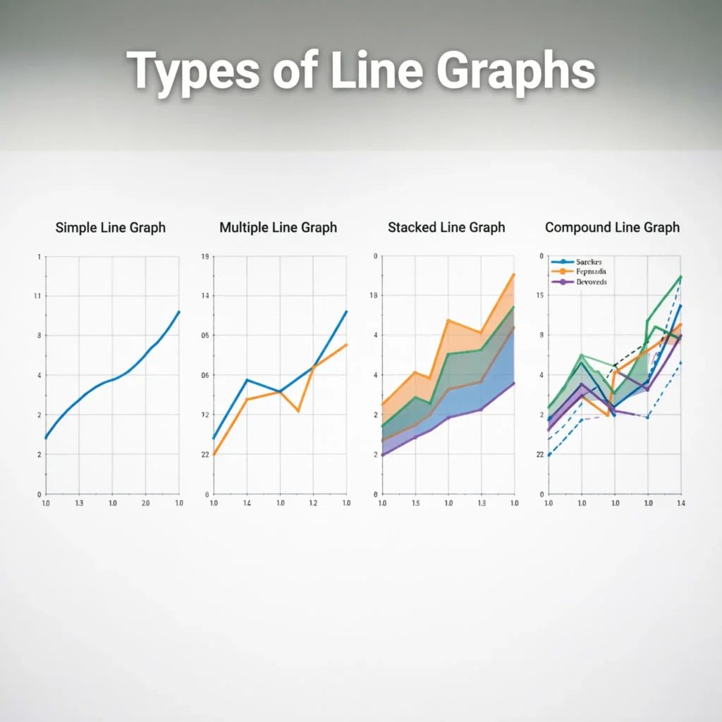
- 📈 Simple line graph uses one data series.
- 📊 Multiple line graph compares several data series.
- 📉 Single-series graph focuses on one measurement.
- 🔗 Multi-series graph shows multiple trends.
- 🕐 Time-series graph displays change over time.
- 📅 Daily line graph uses daily observations.
- 📆 Monthly line graph compares monthly values.
- 📅 Yearly line graph shows long-term changes.
- 📈 Cumulative line graph shows totals building over time.
- 🎯 Target line graph can include a reference goal.
- 🌡️ Weather graphs can show temperature changes.
- 💰 Financial graphs can show price movements.
- 🏫 School graphs can show test results.
- 🧪 Science graphs can show experimental changes.
- 🏢 Business graphs can show sales trends.
- ⭐ The best type depends on the data and purpose.
Simple Line Graph
A simple line graph displays one data series. It is one of the easiest graphs for beginners because there is only one line to follow.
- 📊 It contains one main data series.
- 📍 Each point represents one value.
- 🔗 Points are connected.
- 📈 Trends are easy to see.
- 📉 Decreases are easy to spot.
- ➖ Stable values create flat sections.
- 📝 A title explains the data.
- 🏷️ Axes should be labeled.
- 📏 A consistent scale is important.
- 🎯 It is easy for students to read.
- 📚 It works well for simple projects.
- 🔎 Outliers are easy to identify.
- 📊 It reduces visual clutter.
- ⭐ It is ideal when only one trend matters.
For beginners, a simple line graph is often the best place to start.
Multiple Line Graph
A multiple line graph uses two or more lines to compare different data series. It is useful when you want to see whether several groups or measurements follow similar patterns.
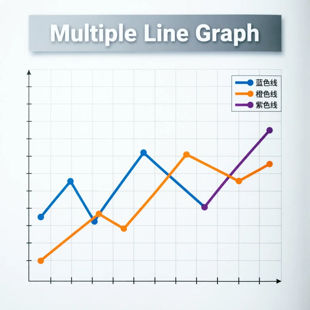
- 📊 It contains multiple data series.
- 🔗 Each series has its own line.
- 📈 Different trends can be compared.
- 🏷️ A legend identifies each line.
- 📅 The same x-axis can be used.
- 🔢 Values should use a compatible scale.
- 🌡️ Different cities can be compared.
- 💰 Different products can be compared.
- 📈 Similar trends become visible.
- 📉 Different trends are easier to compare.
- 🔎 Intersections may show similar values.
- 🎯 Large gaps between lines can be noticed.
- 📊 Too many lines can make a graph confusing.
- ⭐ Keep the design simple and readable.
A multiple line graph is most useful when the reader needs to compare changes rather than study only one series.
Line Graph in Math
Line graphs are closely connected to mathematics because they help students understand numbers, coordinates, change, and relationships.
- 🧮 Students plot ordered pairs.
- 📍 Points represent numerical values.
- ↔️ The x-axis shows one variable.
- ↕️ The y-axis shows another variable.
- 📈 Lines can show increasing values.
- 📉 Lines can show decreasing values.
- 📐 Slope describes how quickly a line changes.
- 🔢 Coordinates help locate points.
- 📝 Graphs can represent equations.
- 🎯 Students can identify trends.
- 🔎 They can compare values.
- 📚 Line graphs appear in school exams.
- ✏️ Graph paper helps students plot data.
- 🧠 Visual information can support understanding.
- ⭐ Graph skills are useful in later mathematics.
A line graph can turn a table of numbers into a visual pattern that is much easier to analyze.
Line Graph in Science
Scientists use line graphs to show how measurements change during an experiment or observation. They are especially useful when one variable changes as another variable changes.
- 🧪 Experiments often produce numerical data.
- 📊 Line graphs display that data clearly.
- 🕐 Time can be an independent variable.
- 🌡️ Temperature can be measured.
- 💧 Water levels can be tracked.
- 🌱 Plant growth can be recorded.
- 📈 Increasing measurements create upward trends.
- 📉 Decreasing measurements create downward trends.
- 📐 Slope can show a rate of change.
- 🔎 Unusual results can become visible.
- 📋 Tables can provide the source data.
- 🧠 Graphs help scientists interpret patterns.
- 📝 Units make scientific graphs clearer.
- ⭐ Accurate scales are important.
A well-made science line graph should clearly identify the variables, units, scale, and source of the measurements.
Line Graph in Business and Finance
Businesses use line graphs to monitor changes in sales, revenue, prices, website visits, customers, and other measurements.
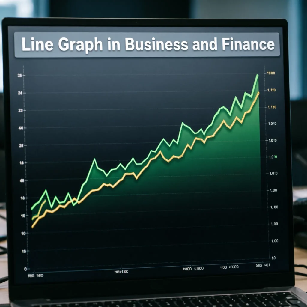
- 💰 Sales can be tracked over time.
- 📈 Revenue trends can be displayed.
- 📉 Falling performance can be identified.
- 🛒 Product demand can be monitored.
- 🌐 Website traffic can be measured.
- 📊 Monthly results can be compared.
- 💼 Managers can study trends.
- 📈 Growth periods become visible.
- 📉 Declining periods become easier to spot.
- 📊 Multiple lines can compare products.
- 🧮 Data can support business decisions.
- 📝 Reports often use line charts.
- ⭐ Clear graphs make reports easier to understand.
It do not explain why a business trend happened, but they can help decision-makers identify when a change occurred.
Line Graph in Daily Life
Line graphs are not limited to classrooms and offices. Many everyday apps and services use them to show changing information.
- 🌡️ Weather apps show temperature trends.
- 💓 Health apps can display measurements over time.
- 💰 Finance apps show price changes.
- 📱 Screen-time apps show daily use.
- 🏃 Fitness apps track activity.
- 🌐 Websites display traffic trends.
- 📚 Learning apps can show progress.
- ⚡ Energy apps can track usage.
- 🛒 Shopping data can show sales patterns.
- 🚗 Travel apps can show changing information.
- 📊 Dashboards use trend charts.
- 📈 Upward trends show increases.
- 📉 Downward trends show decreases.
- ⭐ Graphs help people understand changing information quickly.
Learning to read a line graph is therefore a practical skill, not just a school exercise.
Advantages of a Line Graph
Line graphs are popular because they make trends and changes easy to see. They can communicate a large amount of information without requiring a long explanation.
- 📈 Trends are easy to identify.
- 📉 Decreases are clearly visible.
- 🕐 Time-based data works especially well.
- 🔎 Patterns can stand out.
- 📍 Individual values can be plotted.
- 🔗 Connected points show progression.
- 📚 Students can learn from visual patterns.
- 💼 Businesses can monitor performance.
- 🧪 Scientists can analyze measurements.
- 📝 Graphs can simplify reports.
- 🧠 Visual information can improve understanding.
- 📱 Digital tools can create graphs quickly.
- ⭐ A clear line graph is easy to read.
However, line graphs are most effective when the data has a meaningful order, such as time or another continuous sequence.
How to Read a Line Graph
Reading a line graph requires more than looking at whether the line goes up or down. You should examine the title, axes, scale, points, and overall pattern.
- 📝 Read the title first.
- ↔️ Check the x-axis.
- ↕️ Check the y-axis.
- 🏷️ Read the axis labels.
- 📏 Examine the scale.
- 📍 Locate individual points.
- 🔢 Read their values.
- 📈 Look for increases.
- 📉 Look for decreases.
- ➖ Find stable sections.
- 🔎 Look for unusual points.
- 🕐 Follow the data in order.
- 📊 Compare different periods.
- 🎯 Identify the highest value.
- 📉 Identify the lowest value.
- ⭐ Summarize the overall trend.
Never judge a graph only by how steep the line looks.
Line Graph FAQs
- ❓ What is a line graph? A line graph is a chart that connects data points with lines to show changes or trends.
- 📈 What does an upward line mean? It usually means the measured value is increasing.
- 📉 What does a downward line mean? It usually means the measured value is decreasing.
- ➖ What does a flat line mean? It usually means the value stays constant.
- ↔️ What is the x-axis? It is the horizontal axis and often represents time or an independent variable.
- ↕️ What is the y-axis? It is the vertical axis and often represents the measured quantity.
- 📝 What should a line graph include? A clear title, labeled axes, an appropriate scale, plotted points, and connecting lines.
- 📊 What is a simple line graph? It shows one main data series.
- 🕐 Are line graphs good for time? Yes. They are especially useful for showing changes over days, months, years, or other ordered periods.
- 🧪 Scientists use them to display measurements and experimental results.
- 💼 Businesses use them to monitor sales, revenue, prices, and other trends.
- ⭐ What is the main benefit of a line graph? It makes changes and trends easier to see than a simple list of numbers.
Conclusion:
A line graph is a powerful and easy-to-read way to display changing data. By plotting points and connecting them with lines, it becomes easier to recognize increases, decreases, stable values, patterns, and trends. Line graphs are useful in mathematics, science, business, education, technology, and everyday life.
In 2026, digital dashboards, learning platforms, business reports, and mobile apps continue to make frequent use of line graphs. Whether you are preparing for an exam or trying to understand real-world data, learning how to create and read a line graph is an important skill.

Natalie Carter writes emotional and uplifting lines about relationships, happiness, confidence, and everyday experiences.